01 - Extract UI Items
Navigation Bar Hover Action

User Interface Discussion
I like the way navigation links are given a real-world button feel, where hovering indents the link like a button press.
This was achieved using a box shadow/text shadow and the hover pseudo-class.
Terminal Screen Mockup

User Interface Discussion
I like way they made a simple visual representation of a terminal screen, and even included a span representing each part of a terminal command (path, prompt and command).
This was achieved by using spans with classes relating to each component in a terminal command line. Text is formatted to be monospace and color coded.
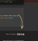
Call to Action GitHub Arrow

User Interface Discussion
The arrow is a simple .png image to utilize transparency, but the positioning is attractive to point directly to the GitHub sponser/link.
This was achieved using an image, but then positioned using absolute to draw attention to it breaking the boundry of its container.
GitHub Pull of Avatar/Icon

User Interface Discussion
I like how the user name has a small avatar pulled from GitHub next to it.
This was achieved mostly via HTML link and image size bounds, and then the image is pulled from githubusercontent.com.