Code
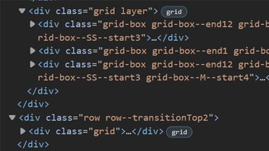
The source code for Envylabs has a large number of classes assigned to divs. Classes appear to follow a structure of increasing specificity, with child elements carrying classes with names that signify their hierarchy.
User Interface - UI
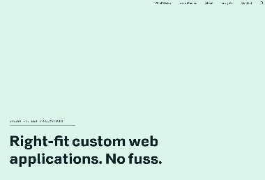
The user interface for Envylabs relies on a traditional navigation bar in the upper right of the page. In lieu of a hamburger icon, the navigation menu shrinks to the word 'Menu' to toggle nav links. Through the body, two different sizes of cards are used to make navigation simple while still having text for an article preview. Text scales frequently based on mobile to tablet to desktop transitions.
User Experience - UX
The Envylabs site is very simple to navigate, and has a minimal amount of text. This makes it feel 'clean' and organized. Outside of a more traditional navigation bar located in the upper right of the page, large animated cards are your first clickable links, and draw a lot of attention. Text is well contrasted on the green and white brand orientated colors, but different sections are highlighted with different background colors, making things feel unique but still part of the central color theme.
Summary
Envylabs is an interesting and very dynamic site. In most cases, I think this wide variety of animations, styling choices, and geometric shapes would make it difficult to maintain a cohesive theme. In this case, however, they seem to pull it off while showcasing their skills in design.