Code
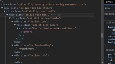
The source code for WoTMUD.org is difficult to follow, with a large number of divs and classes being used. The main body navigation is card based, with a figure structure built around 'flipping' the card to view more details about the main topic. Even within a single card there are several classes being applied, but they do seem to follow a 3-column format specifically called out in the class name.
User Interface - UI
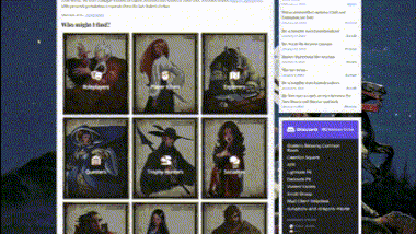
The user interface is busy but offers a lot of functionality. Navigation is top menu based, but there are two menus to choose from. A set of 'important' links sit in a line on top of the page, followed by the header, then the primary menu navigation system. Timestamped announcements are fed off recent forum updates, and a link to Discord is built into the lower right. Red text draws your attention to the primary goal of the site: to get you to play the Wheel of Time Multi-user Dungeon game.
User Experience - UX
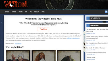
The site has a lot of information to share, but as a result comes off as overly complicated. For a new visitor, it may be overwhelming. The intent of the site was likely to provide utility to players, but in doing so, may scare off newcomers. Displaying recent community announcements is a great way to show site activity and should probably be highlighted more to give the site 'life'. The Discord integration is interesting, but clutters the space, and could be condensed into a single link.
Summary
WoTMUD.info offers a large amount of information, but in doing so, makes navigation a bit complicated and potentially off-putting for new visitors/players.