Code

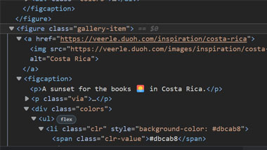
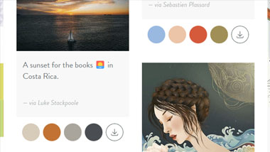
Veerle's site has very well structured HTML and easy to follow CSS class names that complement that structure. There is a gallery section for 'inspiration' that utilizes a card type structure but uses the <figure> element - this allows for a related caption and author to be assigned. Space is also allotted for color swatches that populate contextually off the photo figure.
User Interface - UI

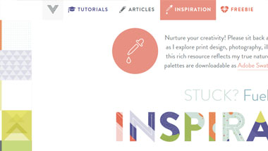
The site has an easy-to-use user interface with 4 primary links in a page-top navigation section. Each section of navigation has its own color and associated icon. The site scales well based on viewport size, but the 'FREEBIE' navigation link disappears when the width is reduced to a minimum, leaving the associated icon overlapping the 'INSPIRATION' text. There are easy to follow and well colored CTAs, and a 'to the top of the page' link that follows your scrolling in the lower right corner.
User Experience - UX

The site has a pleasant and colorful tone, with no dark mode and a cheery pastel palette. The site feels creative and 'artsy', which is complemented by an intuitive 'inspiration' section that displays graphics and their related color swatches that can be downloaded as ASEs.
Summary
In summary, Veerle has a site that blends a pleasant and colorful artsy/designer tone with excellent utility and easy navigation. The code is extensive but well structured, making it easier to follow.